

QuickScan is a mobile document verification tool that helps dealerships quickly verify a customers identity either in person or remotely. This project was developed over the course of 3+ months with 700Credit (an industry-leading dealership software provider.)
Starting the Project
Project Goal
Create a app and web based solution that allows a customer to submit images of their driver’s license (& other documents) for verification. It will use industry supported frameworks to identify legitimate customers.
Target Audience
This service has a very specific target audience of automotive, powersport & RV dealerships. There are two users of the service: the dealership employee (initiates the process) and the dealership customer (completes the process). This is a mobile-only user flow but the process can be initiated from a desktop or tablet by dealership staff.
My Role
My role is the Researcher and Experience & Visual Designer. My responsibilities include wireframing and refining of the user flow to development of the design system/branding and final UI. I also acted as the handoff contact point between design & development teams.
Key Challenges
The number one challenge in creating this app is that it needed to work on a myriad of screen sizes. Additionally, there are two points of customer contact: the dealership side and the dealership customer side. Each has a different experience that needed to be accounted for.
Research & Ideation
Research Study Details
With an increase in online car sales and new types of fraud over the past 5+ years, dealers and their customers are increasingly exposed to fraudulent activity. One of the key components of stopping fraud before it impacts a store is to verify a customer’s identity. But how do you do that when the customer may never physically visit a store or work directly with a dealership employee?
Our research for this project consisted of competitive audits and consultation with industry partners. One of the things that was misunderstood going into the research was the idea that processing of identity documents had already been well-refined. What I learned was that many small improvements would add up to a bigger improvement in the overall user experience.
Initial Design Concepts
Due to our integration with a key partner, I did not need to start the ideation for this project from scratch. I was armed with a partial list of required steps and required objects for the design to be built around. The required aspects of the design allowed me to play with negative space (a positive, given the wide range of screen sizes this app needs to accommodate.) Ultimately, initial design concepts revealed a need for clear CTA’s, grouping of required content and easy-to-understand navigation.
Due to the information I had from the beginning of the project, I jumped straight to low-fidelity digital wireframes.
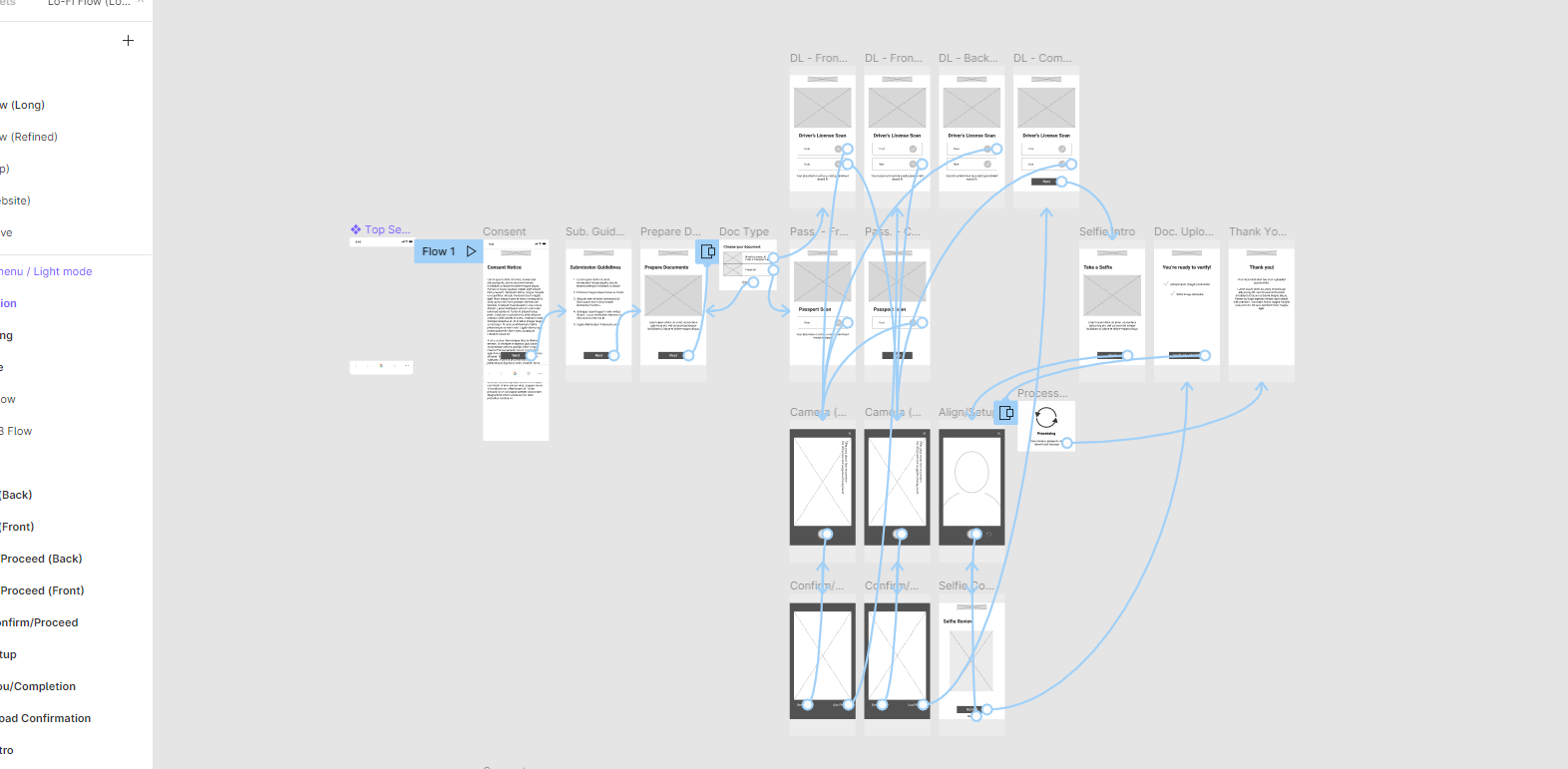
Wireframes
The goal of the digital wireframes was to identify areas of improvement in the user flow. The low-fi prototype went through two iterations: mainly to remove unnecessary steps from the first iteration. These changes resulted in a user flow that is 3 steps shorter than the original. Providing a shorter time for the user to complete the process. See a full lo-fi prototype here.
User Testing
Key insights gathered from testing were: users would like to see a progress bar so they understood their place in the process and had access to previous steps, a need for error notifications to keep a user at ease and not think they had lost input work, and lastly users wanted a way to retake photos they had uploaded to the app.
Hi-Fidelity Prototype & Final Design

Hi-Fidelity Prototype
This high-fidelity prototype is a complete user flow that includes a selfie option to further confirm an identity match. The user flow ends with the “thank you” screen.
Visual Identity

One of the main things that I looked for in usability studies was any indication that a user struggled to trust the process or understand what to do next. The various pain points discovered were addressed with consideration for different color indicators to the “front”, “back” & “selfie” buttons. Blue indicates an action can be taken, grey indicates a prior action in incomplete, green indicates a completed action.
An update to the overall styling of the main action button (see “cancel”) was to give less rounded corners - this aligned with the more serious nature of this app, whereas a rounded button felt too much like something from a game.
Overall the identity for QuickScan is one of trustworthiness and modernity.
Conclusion & Next Steps
Based on initial testing, QuickScan will provide the kind of usefulness for car dealers that it was set out to achieve. Stop fraud from reaching the wider public and their stores. We look forward to launching this product in Q2 of 2022.
As I work through a user flow for any given product I always emphasize the user. There were several opportunities in this project to run away with the design and create something that was more visually stunning or had a bit more “flash”. But that would have only distracted from the simplicity and trustworthiness that the product is meant to present. Staying focused on the user and the simplicity of their journey was my takeaway from this project.
Next Steps
1.
The final designs have been handed off and I continue to work closely with development as they create the website.
2.
I will be working with our app development team to translate the design to our different app development environments - addressing any issues we encounter along the way.
3.
Usability testing will continue as soon as the product is live. I hope to gather more insights on how this process can be further improved.